
Principles of Information Visualization (Visualization Wheel, Data-Ink Ratio, Chart Junk, Lie Factor, Truthful Art)
Original Source: https://www.coursera.org/specializations/data-science-python
Visualization Wheel (Albert Cairo)

A visualization wheel that displays two regions: the top half of the wheel displays terms for complex and deeper visual characteristics and the bottom half of the wheel displays terms for more intelligible and shallower visual characteristics.
Bottom part of the wheel is favored by artists, graphic designers, and journalists, while top part is preferred by scientists and engineers.
There are six pairs of characteristics that are opposite to one another; Abstraction and Figuration, Functionality and Decoration, Density and Lightness, Multidimensionality and Unidimensionality, Originality and Familiarity, Novelty and Redundancy.
Visualization Wheel Dimensions
- Abstraction – Figuration
Boxes and charts (abstraction) or real-world physical objects (figuration) - Functionality – Decoration
No embellishments (functionality) or artistic embellishments (decoration) - Density – Lightness
Must be studied in depth (density) or understandable at a glance (lightness) - Multidimensional – Unidimensional
Different aspects of phenomena (multidimensional) or single or few items of phenomenal (unidimensional) - Originality – Familiarity
Novel methods of visualization (originality) or established and well understood methods of visualization (familiarity) - Novelty – Redundancy
Explaining each item once (novelty) or encoding multiple explanations of the same phenomena (redundancy)
Data-Ink Ratio (Edward Tufte)
Tufte refers to data-ink as the non-erasable ink used for the presentation of data. If data-ink would be removed from the image, the graphic would lose the content. Non-Data-Ink is accordingly the ink that does not transport the information but it is used for scales, labels and edges.
The Data-ink ratio is the ratio of Data-Ink to non-Data-Ink. According to Tufte, Data-ink ratio of a good graphic is low.
High Data-Ink ratio

Low Data-Ink ratio
Chart Junk (Edward Tufte)
Chartjunk refers to all visual elements in charts and graphs that are not necessary to comprehend the information represented on the graph, or that distract the viewer from this information.
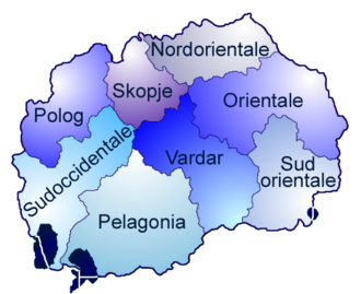
A map with chartjunk: the gradients inside each province are not nocessary.
However, some says that graphics like following are effective.
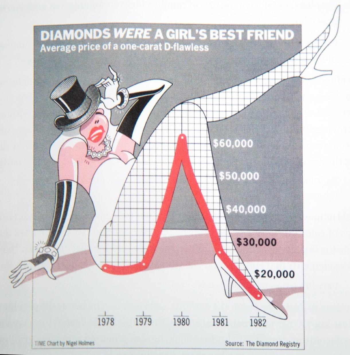
It’s an infographic of a woman whose bended leg coincides with the trend of diamond price. From ankle to knee, the price changes from lowest to highest over time.
By combining image with graph, it made viewers remember the spike shape of the graph more easily.
Lie Factor (Edward Tufte)
Lie Factor is the size of an effect shown in a graph divided by the actual size of the effect in the data on which the graph is based.
Tufte states that the representation of numbers, as physically measured on the surface of the graphic itself, should be directly proportional to the quantities represented. (Lie Factor = 1)
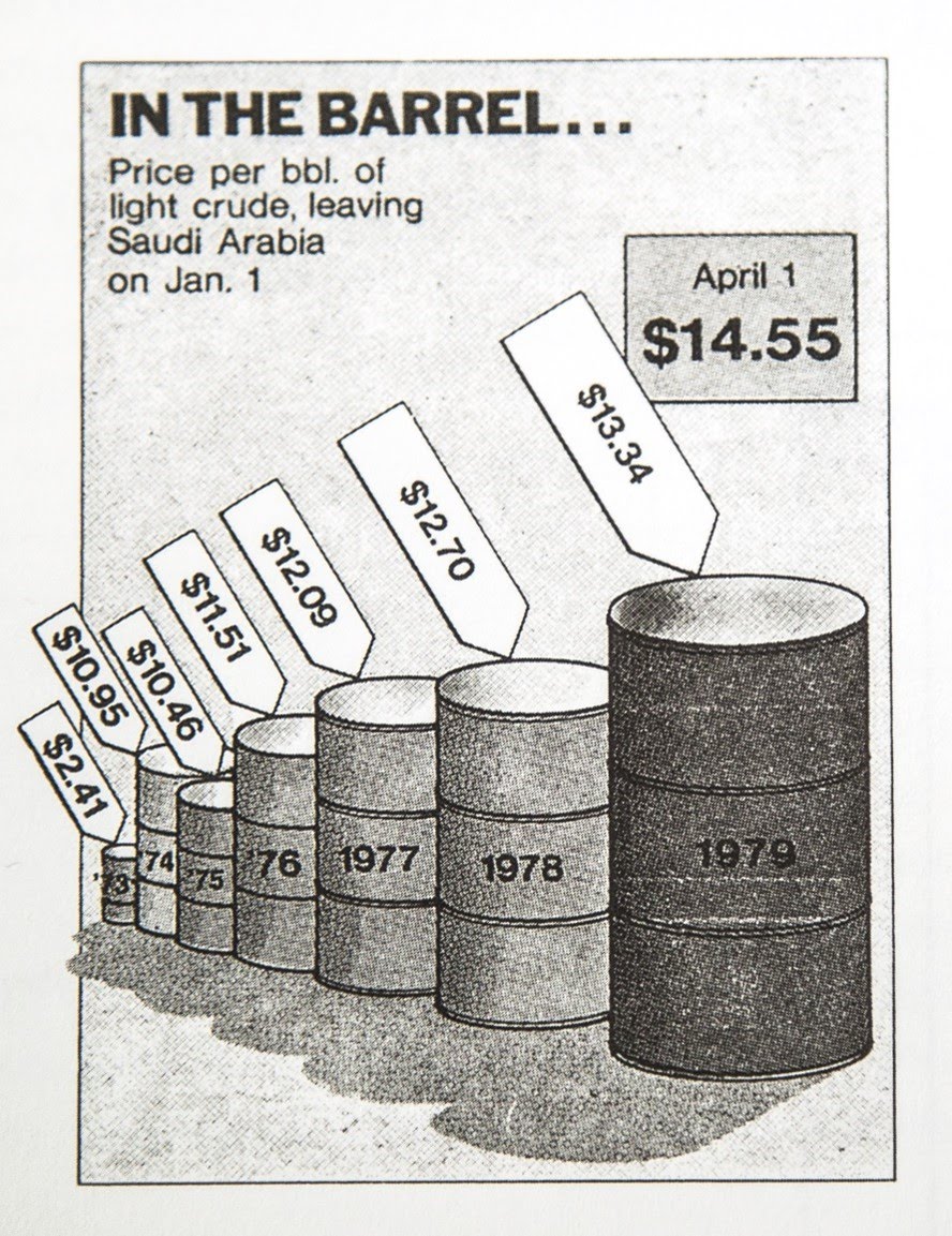
Effect of the volume is 9.4 times the stated prices.
Qualities of a Great Visualization (Albert Cairo ‘The Truthful Art’)
1. Truthful
Be aware of your actions when cleaning, summarizing and manipulating data and ensure you aren’t
- Misleading yourself (self deception)
- Misleading your audience
Example of Untruthful chart
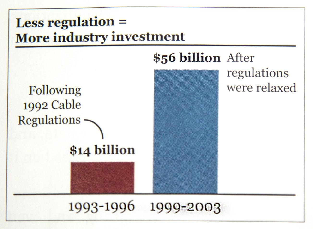
First, it’s unclear whether the monies are adjusted for inflation. Second, the tiem spans for the two bars are different. Finally, there seems to be a bunch of missing data from years 1997 and 1998.
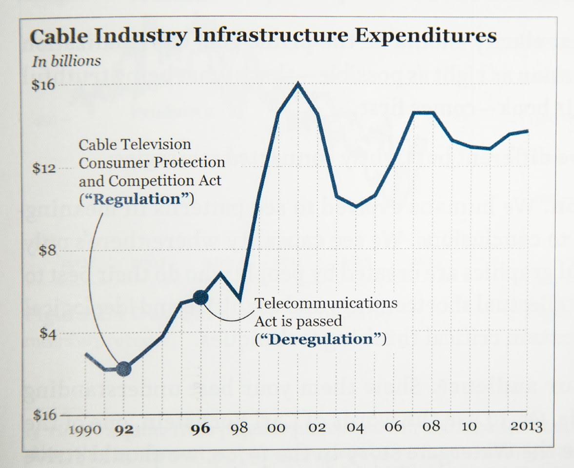
More honest chart
2. Functionality
Does audience take information from the visualization effectively? Reducing data ink ratio by removing backgrounds, redundant labels, borders, colors, special effects, and lightening labels is an example of increasing functionality.
3. Beauty
Beauty in a visualization might be conflationary, considering the concepts ‘chart junk’ and ‘data-ink ratio’.
4. Insightful
Visualizations shouldn’t just replicate data in tables, but they should draw the viewer in such that the viewer has an aha or eureka moment.
5. Enlightening
A combination of the previous four, but with a social ethical responsibility


Leave a Comment