
Unsupervised Learning with scikit learn
Original Source: https://www.coursera.org/learn/machine-learning
Introduction to Unsupervised Learning
Unsupervised learning involves tasks that operate on datasets without labeled responses or target values. Instead, the goal is to capture interesting structure or information.
Applications of unsupervised learning:
- Visualize structure of a complex dataset.
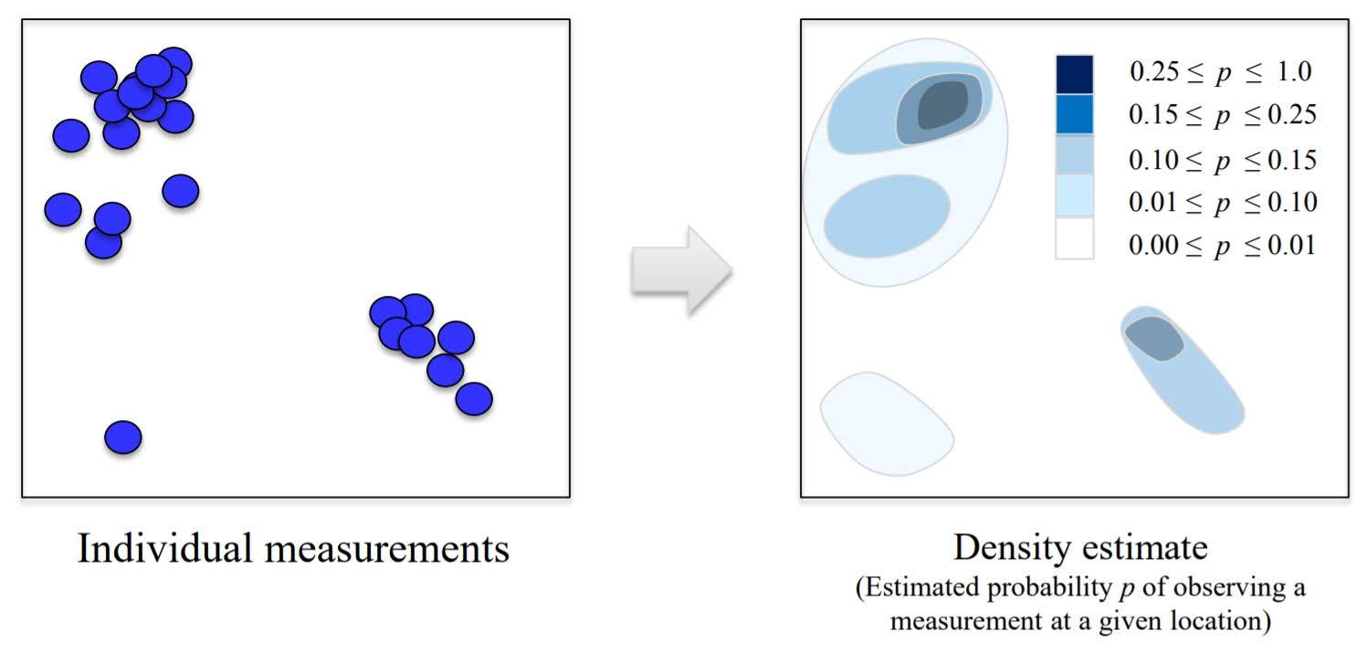
- Density estimation to predict probabilities of events.
- Compress and summarize the data.
- Extract features for supervised learning.
- Discover important clusters or outliers.
Two major methods
- Transformations: processes that extract or comput information
- Clustering: find groups in the data and assign every point in the dataset to one of the groups
Transformation
A. Density Estimation
B. Dimensionality Reduction
- Finds an approximate version of your dataset using fewer features.
- Used for exploring and visualizing a dataset to understand grouping or relationships
- Often visualized using a 2-dimensional scatterplot
- Also used for compression, finding features for supervised learning
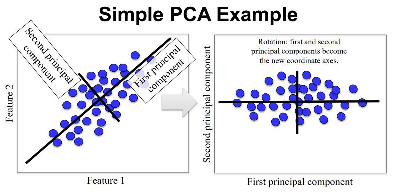
1. Principle Component Analysis (PCA)
Principal component analysis (PCA) is a statistical procedure that uses an orthogonal transformation to convert a set of observations of possibly correlated variables into a set of values of linearly uncorrelated variables called principal components.
PCA can be thought of as fitting an n-dimensional elipsoid to the data, where each axis of the ellipsoid represents a principal component. If some axis of the ellipsoid is small, then the variance along that axis is also small, and by omitting that axis and its corresponding principal component from our representation of the dataset, we lose only a commensurately small amount of information.
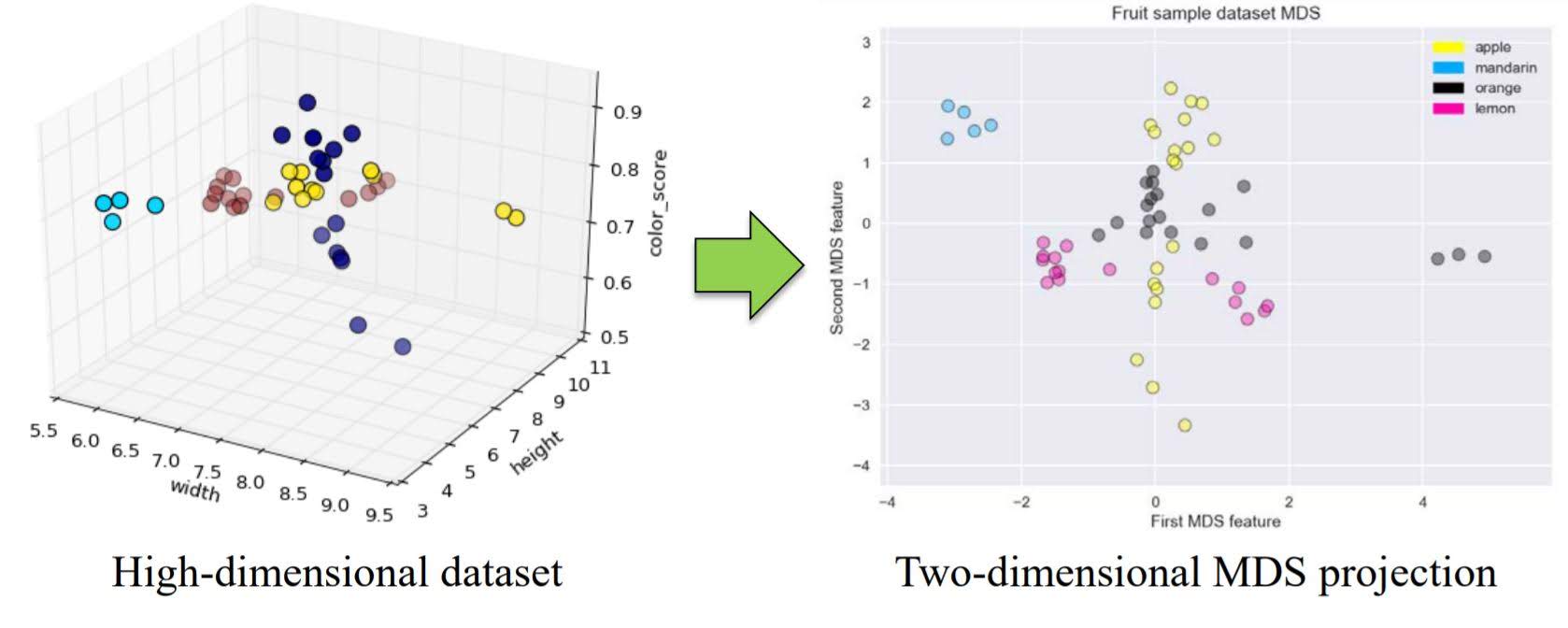
2. Multidimensional Scaling (MDS)
Multidimensional scaling (MDS) attempts to find a distance-preserving low-dimensional projection.
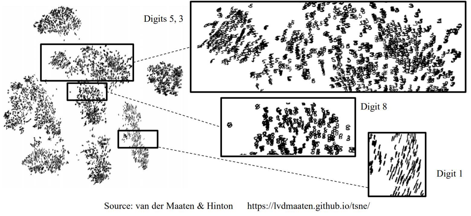
3. t-distributed stochastic neighbor embedding (t-SNE)
t-SNE is a powerful manifold learning method that finds a 2D projection preserving information about neighbors.
2D projection of a mnist dataset using t-SNE
Clustering
Clustering is finding a way to divide a dataset into groups(‘clusters’).
Clustering algorithms output a cluster membership index for each data point
1. K-means Clustering
Initialization
Pick the number of clusters k you want to find. Then pick k random points to serve as an initial guess for the cluster centers.
Step A
Assign each data point to the nearest cluster center.
Step B
Update each cluster center by replacing it with the mean of all points assigned to that cluster (in step A).
Repeat steps A and B until the centers converge to a stable solution.

Pros and Cons
Works well for simple clusters that are same size, well-separated, globular shapes.
Does not do well with irregular, complex clusters.
2. Hierarchical Clustering
Two types
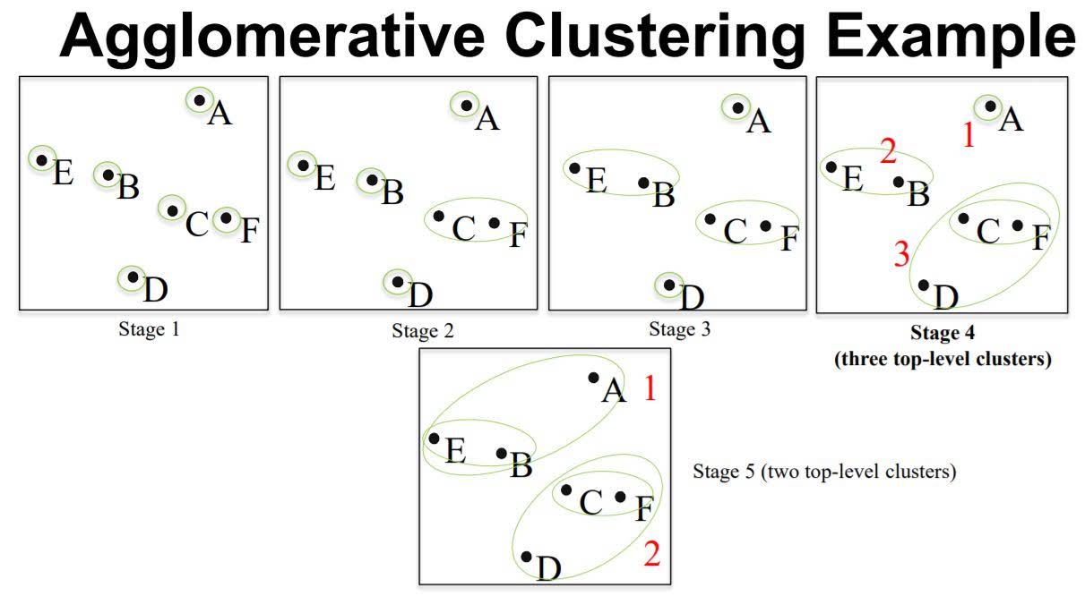
- Agglomerative: This is a “bottom up” approach: each observation starts in its own cluster, and pairs of clusters are merged as one moves up the hierarchy.
- Divisive: This is a “top down” approach: all observations start in one cluster, and splits are performed recursively as one moves down the hierarchy.
Agglomerative Clustering
In order to decide which clusters should be combined (for agglomerative), or where a cluster should be split (for divisive), a measure of dissimilarity between sets of observations is required. In most methods of hierarchical clustering, this is achieved by use of an appropriate metric (a measure of distance between pairs of observations), and a linkage criterion which specifies the dissimilarity of sets as a function of the pairwise distances of observations in the sets.
Commonly used metric is ‘Euclidean distance’.
Linkage Criteria for Agglomerative Clustering
- Ward’s method – Least increase in total variance (around cluster centroids)
- Average linkage – Average distance between clusters
- Complete linkage – Max distance between clusters
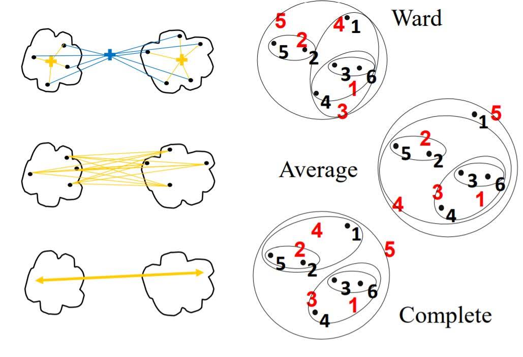
When we have decided metric and linkage criteria, we compute the similarity score of each pairs of data points. Then group most similar points. We repeat this until we get to the given number of clusters.
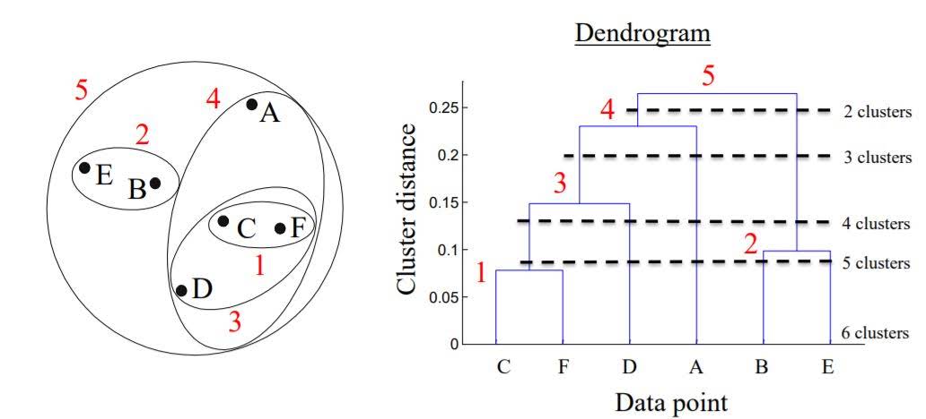
Dendrogram
We can plot graph that shows how the clustering evolved.
3. Density-based spatial clustering of applications with noise (DBSCAN)
It is a density-based clustering algorithm: given a set of points in some space, it groups together points that are closely packed together (points with many nearby neighbors), marking as outliers points that lie alone in low-density regions (whose nearest neighbors are too far away). DBSCAN is one of the most common clustering algorithms and also most cited in scientific literature.
Algorithm
The two main parameters for DBSCAN are min samples and eps.
For a given data point, if there are min sample of other data points that lie within a distance of eps, that given data point is labeled as a core sample. Then, all core samples that are with a distance of eps units apart are put into the same cluster.
In addition to points being categorized as core samples, points that don’t end up belonging to any cluster are considered as noise.
While points that are within a distance of eps units from core points, but not core points themselves, are termed boundary points.
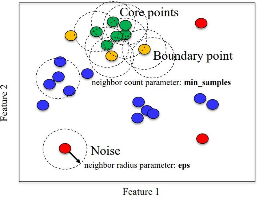
- Unlike k-means, you don’t need to specify # of clusters.
- Relatively efficient – can be used with large datasets
- Identifies likely noise points
Unsupervised Learning with scikit
Preamble and Datasets
%matplotlib inline
import numpy as np
import pandas as pd
import seaborn as sn
import matplotlib.pyplot as plt
from sklearn.datasets import load_breast_cancer

np.random.seed(0)

# Breast cancer dataset
cancer = load_breast_cancer()
(X_cancer, y_cancer) = load_breast_cancer(return_X_y = True)

# Our sample fruits dataset
fruits = pd.read_table('fruit_data_with_colors.txt')
X_fruits = fruits[['mass','width','height', 'color_score']]
y_fruits = (fruits[['fruit_label']] - 1)['fruit_label']
Dimensionality Reduction
Principal Components Analysis (PCA)
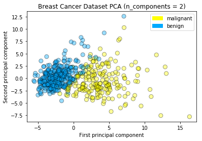
Using PCA to find the first two principal components of the breast cancer dataset
from sklearn.preprocessing import StandardScaler
from sklearn.decomposition import PCA
from sklearn.datasets import load_breast_cancer

cancer = load_breast_cancer()
(X_cancer, y_cancer) = load_breast_cancer(return_X_y = True)

# Before applying PCA, each feature should be centered (zero mean) and with unit variance
X_normalized = StandardScaler().fit(X_cancer).transform(X_cancer)

pca = PCA(n_components = 2).fit(X_normalized)

X_pca = pca.transform(X_normalized)
print(X_cancer.shape, X_pca.shape)
(569, 30) (569, 2)
Plotting the PCA-transformed version of the breast cancer dataset
from adspy_shared_utilities import plot_labelled_scatter
plot_labelled_scatter(X_pca, y_cancer, ['malignant', 'benign'])

plt.xlabel('First principal component')
plt.ylabel('Second principal component')
plt.title('Breast Cancer Dataset PCA (n_components = 2)')
plt.show()
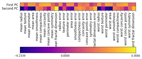
Plotting the magnitude of each feature value for the first two principal components
fig = plt.figure(figsize=(8, 4))
plt.imshow(pca.components_, interpolation = 'none', cmap = 'plasma')
feature_names = list(cancer.feature_names)

plt.gca().set_xticks(np.arange(-.5, len(feature_names)));
plt.gca().set_yticks(np.arange(0.5, 2));
plt.gca().set_xticklabels(feature_names, rotation=90, ha='left', fontsize=12);
plt.gca().set_yticklabels(['First PC', 'Second PC'], va='bottom', fontsize=12);

plt.colorbar(orientation='horizontal', ticks=[pca.components_.min(), 0,
                                              pca.components_.max()], pad=0.65);
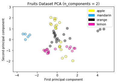
PCA on the fruit dataset
from sklearn.preprocessing import StandardScaler
from sklearn.decomposition import PCA

# each feature should be centered (zero mean) and with unit variance
X_normalized = StandardScaler().fit(X_fruits).transform(X_fruits)

pca = PCA(n_components = 2).fit(X_normalized)
X_pca = pca.transform(X_normalized)

plot_labelled_scatter(X_pca, y_fruits, ['apple','mandarin','orange','lemon'])

plt.xlabel('First principal component')
plt.ylabel('Second principal component')
plt.title('Fruits Dataset PCA (n_components = 2)');
Multidimensional scaling (MDS)
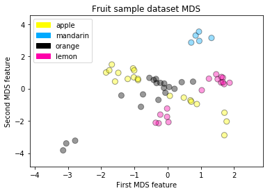
MDS on the fruit dataset
from adspy_shared_utilities import plot_labelled_scatter
from sklearn.preprocessing import StandardScaler
from sklearn.manifold import MDS

# each feature should be centered (zero mean) and with unit variance
X_fruits_normalized = StandardScaler().fit(X_fruits).transform(X_fruits)

mds = MDS(n_components = 2)

X_fruits_mds = mds.fit_transform(X_fruits_normalized)

plot_labelled_scatter(X_fruits_mds, y_fruits, ['apple', 'mandarin', 'orange', 'lemon'])
plt.xlabel('First MDS feature')
plt.ylabel('Second MDS feature')
plt.title('Fruit sample dataset MDS');
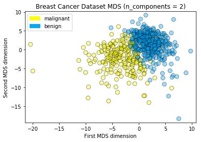
MDS on the breast cancer dataset
from sklearn.preprocessing import StandardScaler
from sklearn.manifold import MDS
from sklearn.datasets import load_breast_cancer

cancer = load_breast_cancer()
(X_cancer, y_cancer) = load_breast_cancer(return_X_y = True)

# each feature should be centered (zero mean) and with unit variance
X_normalized = StandardScaler().fit(X_cancer).transform(X_cancer)

mds = MDS(n_components = 2)

X_mds = mds.fit_transform(X_normalized)

from adspy_shared_utilities import plot_labelled_scatter
plot_labelled_scatter(X_mds, y_cancer, ['malignant', 'benign'])

plt.xlabel('First MDS dimension')
plt.ylabel('Second MDS dimension')
plt.title('Breast Cancer Dataset MDS (n_components = 2)');
t-SNE
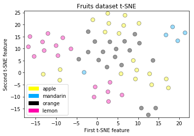
t-SNE on the fruit dataset
from sklearn.manifold import TSNE

tsne = TSNE(random_state = 0)

X_tsne = tsne.fit_transform(X_fruits_normalized)

plot_labelled_scatter(X_tsne, y_fruits,
    ['apple', 'mandarin', 'orange', 'lemon'])
plt.xlabel('First t-SNE feature')
plt.ylabel('Second t-SNE feature')
plt.title('Fruits dataset t-SNE');
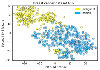
t-SNE on the breast cancer dataset
tsne = TSNE(random_state = 0)

X_tsne = tsne.fit_transform(X_normalized)

plot_labelled_scatter(X_tsne, y_cancer,
    ['malignant', 'benign'])
plt.xlabel('First t-SNE feature')
plt.ylabel('Second t-SNE feature')
plt.title('Breast cancer dataset t-SNE');
Clustering
K-means
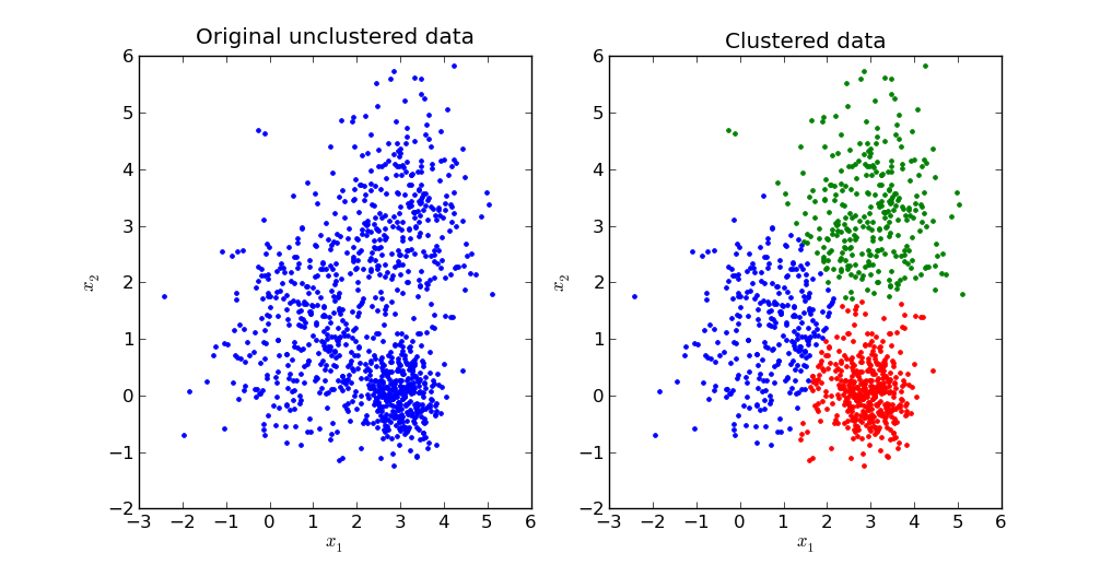
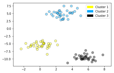
Creates an artificial dataset with make_blobs, then applies k-means to find 3 clusters, and plots the points in each cluster identified by a corresponding color.
from sklearn.datasets import make_blobs
from sklearn.cluster import KMeans
from adspy_shared_utilities import plot_labelled_scatter

X, y = make_blobs(random_state = 10)

kmeans = KMeans(n_clusters = 3)
kmeans.fit(X)

plot_labelled_scatter(X, kmeans.labels_, ['Cluster 1', 'Cluster 2', 'Cluster 3'])
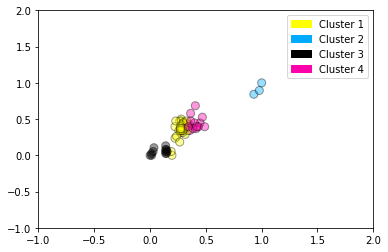
Example showing k-means used to find 4 clusters in the fruits dataset. Note that in general, it’s important to scale the individual features before applying k-means clustering.
from sklearn.datasets import make_blobs
from sklearn.cluster import KMeans
from adspy_shared_utilities import plot_labelled_scatter
from sklearn.preprocessing import MinMaxScaler

fruits = pd.read_table('fruit_data_with_colors.txt')
X_fruits = fruits[['mass','width','height', 'color_score']].values
y_fruits = fruits[['fruit_label']] - 1

X_fruits_normalized = MinMaxScaler().fit(X_fruits).transform(X_fruits)

kmeans = KMeans(n_clusters = 4, random_state = 0)
kmeans.fit(X_fruits)

plot_labelled_scatter(X_fruits_normalized, kmeans.labels_,
                      ['Cluster 1', 'Cluster 2', 'Cluster 3', 'Cluster 4'])
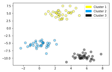
Agglomerative clustering
from sklearn.datasets import make_blobs
from sklearn.cluster import AgglomerativeClustering
from adspy_shared_utilities import plot_labelled_scatter

X, y = make_blobs(random_state = 10)

cls = AgglomerativeClustering(n_clusters = 3)
cls_assignment = cls.fit_predict(X)

plot_labelled_scatter(X, cls_assignment,
        ['Cluster 1', 'Cluster 2', 'Cluster 3'])
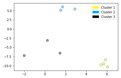
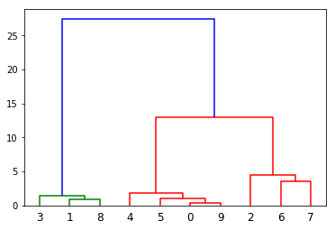
Creating a dendrogram (using scipy)
This dendrogram plot is based on the dataset created in the previous step with make_blobs, but for clarity, only 10 samples have been selected for this example, as plotted here:
X, y = make_blobs(random_state = 10, n_samples = 10)
plot_labelled_scatter(X, y,
        ['Cluster 1', 'Cluster 2', 'Cluster 3'])
print(X)
[[  5.69192445  -9.47641249]
 [  1.70789903   6.00435173]
 [  0.23621041  -3.11909976]
 [  2.90159483   5.42121526]
 [  5.85943906  -8.38192364]
 [  6.04774884 -10.30504657]
 [ -2.00758803  -7.24743939]
 [  1.45467725  -6.58387198]
 [  1.53636249   5.11121453]
 [  5.4307043   -9.75956122]]
And here’s the dendrogram corresponding to agglomerative clustering of the 10 points above using Ward’s method. The index 0..9 of the points corresponds to the index of the points in the X array above. For example, point 0 (5.69, -9.47) and point 9 (5.43, -9.76) are the closest two points and are clustered first.
from scipy.cluster.hierarchy import ward, dendrogram
plt.figure()
dendrogram(ward(X))
plt.show()
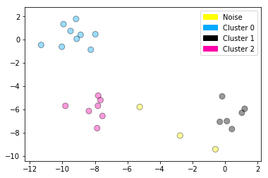
DBSCAN clustering
from sklearn.cluster import DBSCAN
from sklearn.datasets import make_blobs

X, y = make_blobs(random_state = 9, n_samples = 25)

dbscan = DBSCAN(eps = 2, min_samples = 2)

cls = dbscan.fit_predict(X)
print("Cluster membership values:\n{}".format(cls))

plot_labelled_scatter(X, cls + 1,
        ['Noise', 'Cluster 0', 'Cluster 1', 'Cluster 2'])
Cluster membership values:
[ 0  1  0  2  0  0  0  2  2 -1  1  2  0  0 -1  0  0  1 -1  1  1  2  2  2
  1]


Leave a Comment